An End-to-End App Case Study:
No You Pick!
An End-to-End App Case Study:
No You Pick!
Introducing a restaurant discovery app design that streamlines group decisions with gamified results and anonymous polling!
Introducing a restaurant discovery app design that streamlines group decisions with gamified results and anonymous polling!
View Prototype
View Prototype
Timeline:
Timeline:
8 weeks,
Jan - Mar 2025
~ 100 hours
Duration:
Jan - Mar,
100 hours
Role:
Role:
UI UX Designer
Tools Used:
Tools Used:
Figma, Figjam
Loom
Maze
Figma, Figjam
Loom
Maze
Key Skills:
Key Skills:
Native Mobile App
Visual Design
Interaction Design
Content Strategy
Native Mobile App
Visual Design
Interaction Design
Content Strategy
Finding a Problem
Finding a Problem
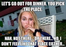
You're out with friends, everyone’s hungry, but no one can decide where to eat.
After scrolling through multiple apps for 20 minutes, frustration sets in—someone finally picks a place just to end the indecision.
The current decision making is fragmented.
How might we simplify the decision-making process for families so they can quickly choose a restaurant without stress or argument?
The current way we search includes going to Google Maps or Yelp. Then Instagram, and sending options to group chat via poll apps like Doodle.
The current way we search includes going to Google Maps or Yelp. Then Instagram, and sending options to group chat via poll apps like Doodle.
Research & Insights
Research & Insights
I interviewed 5 participants remotely to identify key patterns on how people decide where to eat out.
This research found:
100% participants chose base on the "vibe" and what the restaurant looked like.
60% of participants stated they'd try new places 60-70% of time.
I was surprised to find 40% of participants said they explore new spots 5% of time.
This led to incorporating a "favorites only" option.
All participants mentioned visual content being a heavy factor, and going to social media like Instagram to find menu photos.
Distance and Cuisine type were the top two priorities.
I interviewed 5 participants remotely to identify key patterns on how people decide where to eat out.
This research found:
Distance and Cuisine type were the top two priorities.
100% participants chose base on the "vibe" and what the restaurant looked like.
All participants mentioned Visual Content being a heavy factor, & going to social media like Instagram to find menu items.
60% of participants stated they'd try new places 60-70% of time.
I was surprised to find 40% of participants said they explore new spots 5% of time.
This led to incorporating a "favorites only" option.


From foodies to young professionals with limited time to families of 4 with diverse tastes, it's overwhelming to choose a good restaurant.
From foodies to young professionals with limited time to families of 4 with diverse tastes, it's overwhelming to choose a good restaurant.
On the market today there are limited apps in this niche and one direct competitor which is live in California only. The other food apps focus around eating at home, or specific dietary restrictions, see above.
On the market today there are limited apps in this niche and one direct competitor which is live in California only. The other food apps focus around eating at home, or specific dietary restrictions, see above.
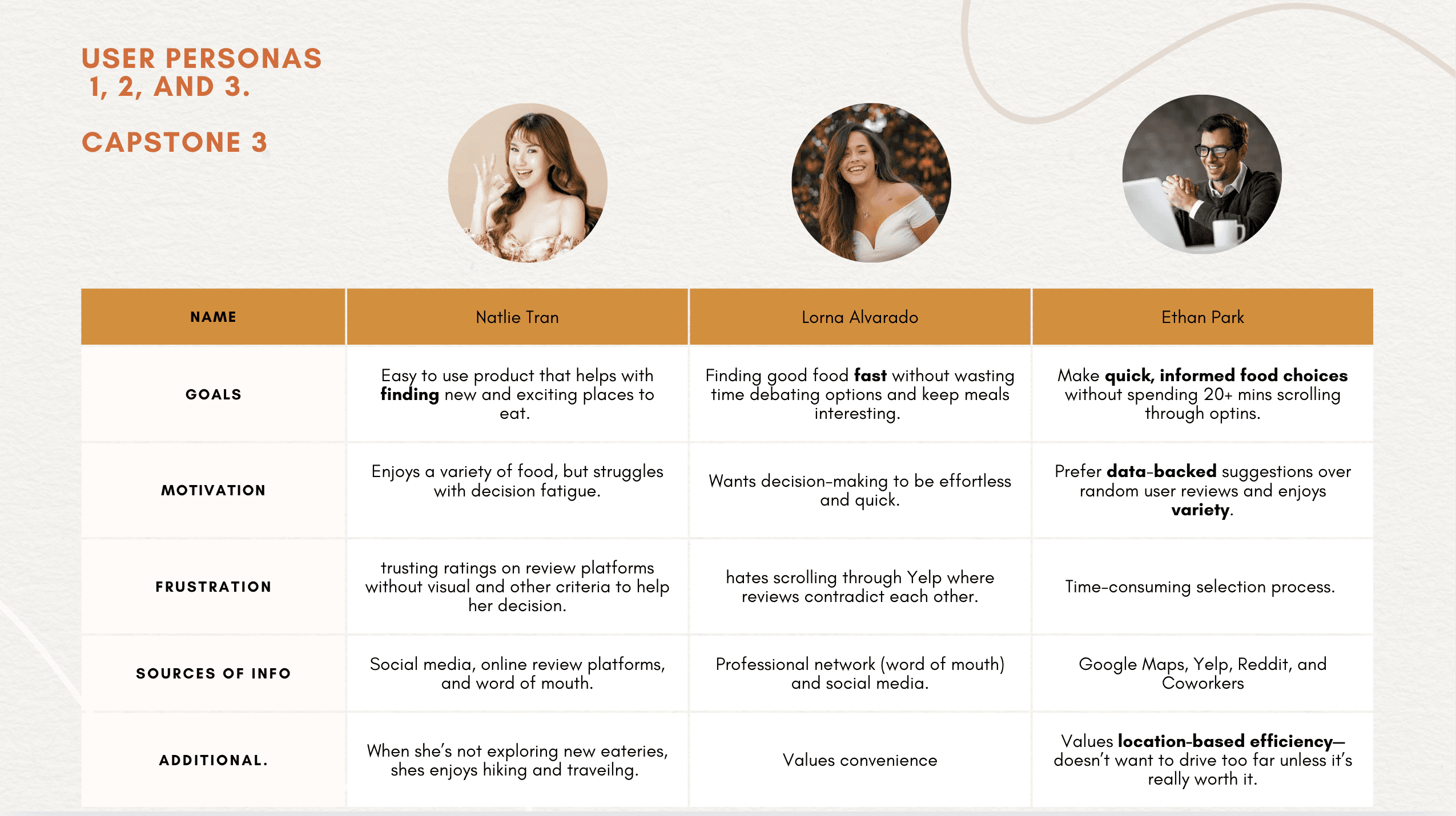
For this project, I anchored the experience around Ms. Foodie, Ms. Young Professional, and Mr. Efficiency.
For this project, I anchored the experience around Ms. Foodie, Ms. Young Professional, and Mr. Efficiency.
Design Goals & Strategy
Design Goals & Strategy
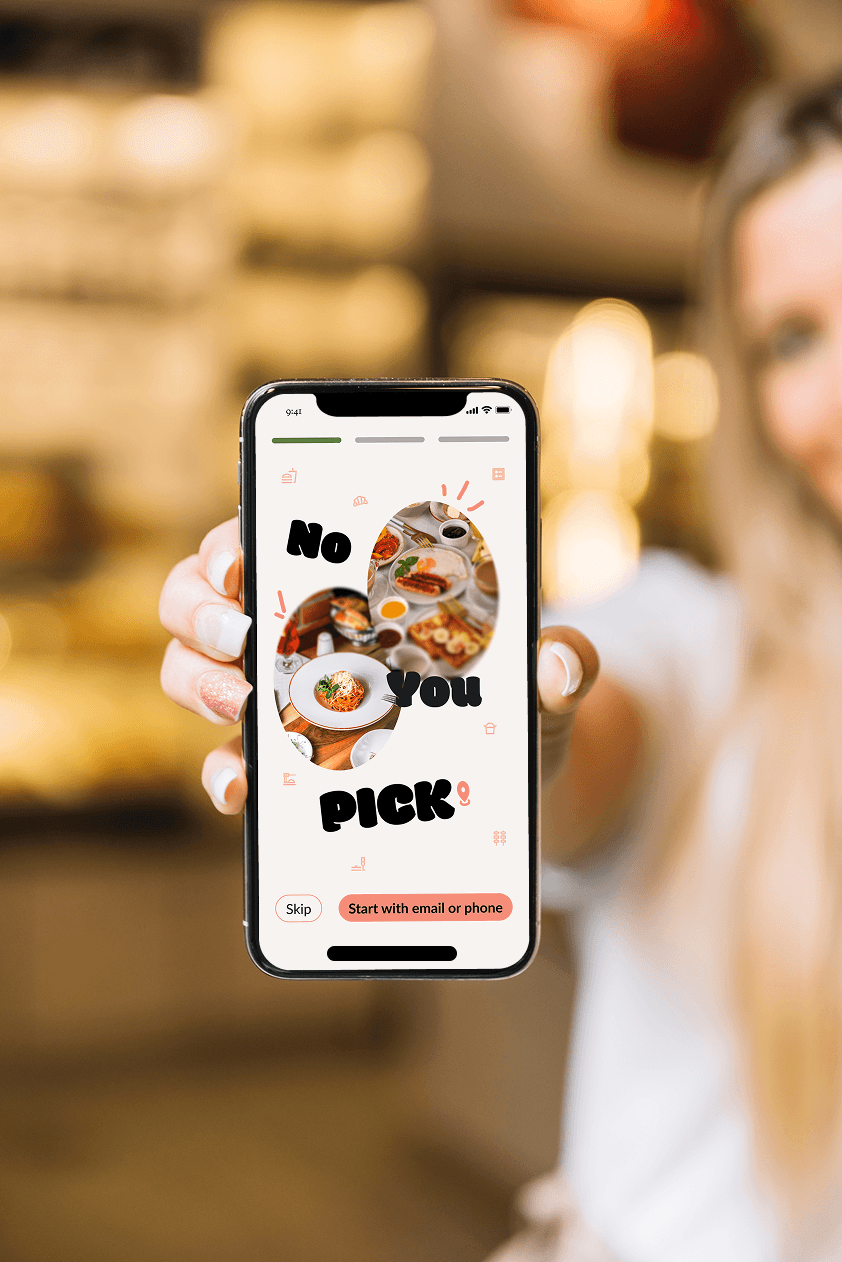
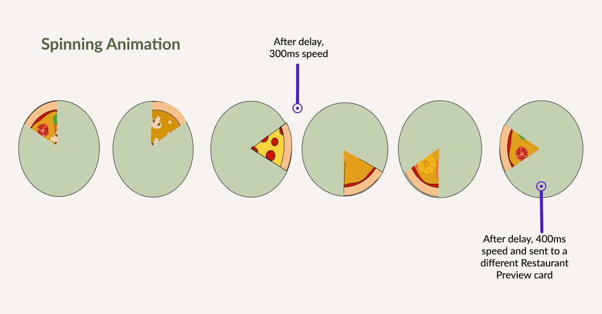
My goal is to make this frustrating, time-consuming process as easy as spinning the wheel.
The Quick Start screen features intuitive, user-tested filters, visually engaging results, and an anonymous group polling option—empowering No You Pick users to make confident decisions quickly.
My strategy prioritizes effortless usability, integrating with Google Maps and Yelp while keeping the experience fun, social, and frustration-free.
My goal is to make this frustrating, time-consuming process as easy as spinning the wheel a few times.
A Quick Start screen with intuitive filters, ranked through interviews, resulting in engaging visuals, and an anonymous group polling feature, No You Pick empowers users to make confident decisions quickly.
My strategy prioritizes effortless usability, integrating with Google Maps and Yelp while keeping the experience fun, social, and frustration-free.
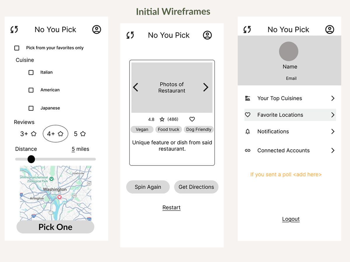
Wireframing to Prototype
Wireframing to Prototype
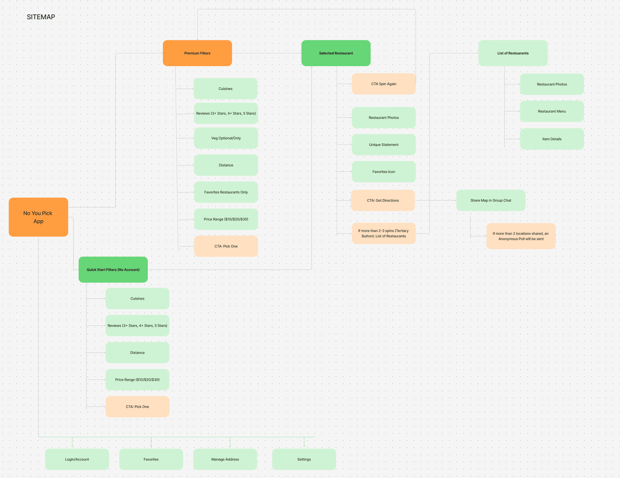
I started sketching key user flows, a sitemap, and hand low-fi sketches before applying interactions, discussing usability and button labels clarity and the user's journey.
I started sketching key user flows, a sitemap, and hand low-fi sketches before applying interactions, discussing usability and button labels clarity and the user's journey.
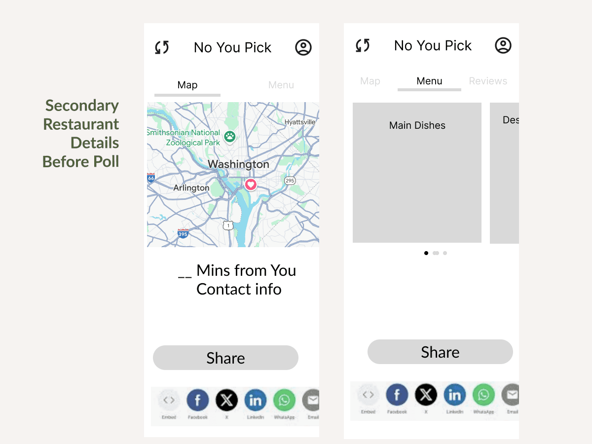
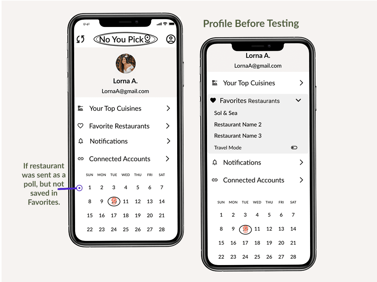
A few edge cases arose including 1) using this when traveling and 2) what if you don't save a restaurant, but sent it in a poll? For this, I added a calendar in Profile (before), and added into the test. After a few tests, I quickly changed to further A/B test "Recently Polled" or "History", with "History" winning.
A few edge cases arose including what if you don't save a restaurant, but sent it in a poll? For this I created a calendar view with the branded logo indicator, which was not clear in testing. I A/B tested "Recently Polled" and "History" with "History" winning.
See the process carousel for hand sketch to low-fi to mid-fi to prototype.
See the process carousel for hand sketch to low-fi to mid-fi to prototype.


Functionality and A/B Testing
Functionality and A/B Testing
16 participants tested navigation expectations with 88% saying they were excited to try this app!
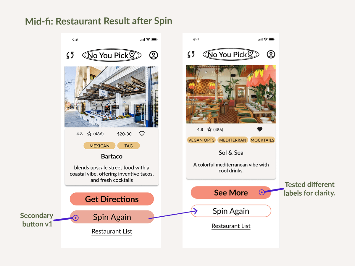
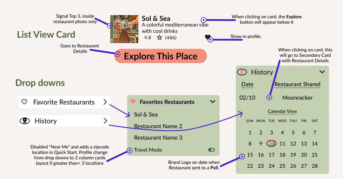
The restaurant card's primary button shows more restaurant details. I tested 6 different labels for this button, see the before restaurant card. During testing, many participants preferred to click into the card vs clicking the main button. Some of my labels were too specific.
Originally the "restaurant list" option would appear after 3 spins. After multiple discussions, I created a third button "Restaurant List" (tertiary) on the first results page.
16 participants tested navigation expectations with 88% saying they were excited to try this app!
The restaurant card's primary button shows more restaurant details. I tested 6 different labels for this button, see the before restaurant card. During testing, many participants preferred to click into the card vs clicking the main button. Some of my labels were too specific.
Originally the "restaurant list" option would appear after 3 spins. After multiple discussions, I created a third button "Restaurant List" (tertiary) on the first results page.
Visual Branding
Visual Branding
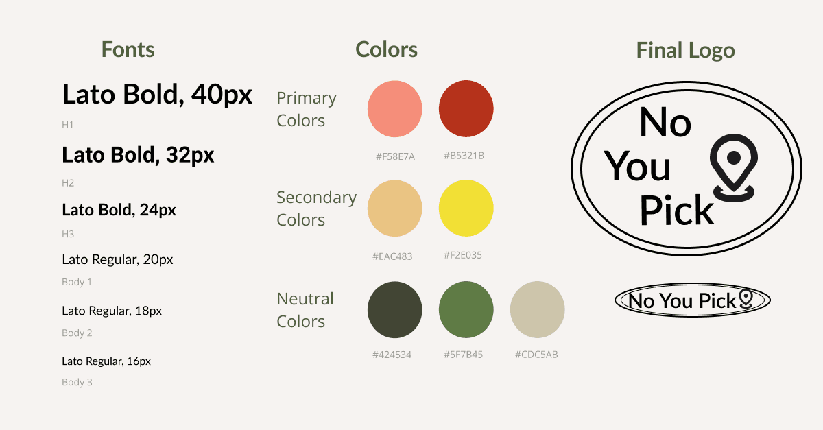
After refining usability patterns in team meetings, I dedicated a week to craft the logo, finalize the color palette with accessibility in mind, and incorporate vibrant restaurant photos. These elements brought the wireframes to life, elevating them to be ready for testing.
While exploring colors in other food apps, I noticed they mostly relied on bright, high-contrast palettes as seen in the mood board preview.
For this project, I wanted the restaurants to be the focal point, so I chose a muted color palette that feels both playful and inviting.
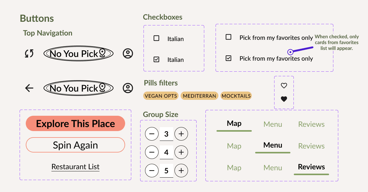
Below I created the UI Kit and component library for the handoff to developers of the design system. This along with a loom walkthrough would be apart of the documentation for the build phase.
For this project, I wanted the restaurants to be the focal point, so I chose a muted color palette that feels both playful and inviting.
Below I created the UI Kit and component library for the handoff to developers of the design system. This along with a loom walkthrough would be apart of the documentation for the build phase.


Final Testing and Designs
Final Testings
Final Designs
5 participants were tested through a mix of moderated virtual sessions and unmoderated maze tests.
The app had a ease-of-use score of 76%, indicating a largely intuitive experience.
60% would spin again to see another restaurant and they liked the option for the restaurant list even if they took more than 2-3 spins before checking.
During the maze tests, I created separate paths for spinning again or clicking restaurant list. Then had a follow up question asking "after the first spin, do you choose restaurant list or spin again?" I found 2 participants contradicted their answer of choosing the "restaurant list" when the heatmaps showed they spun again after the first result.
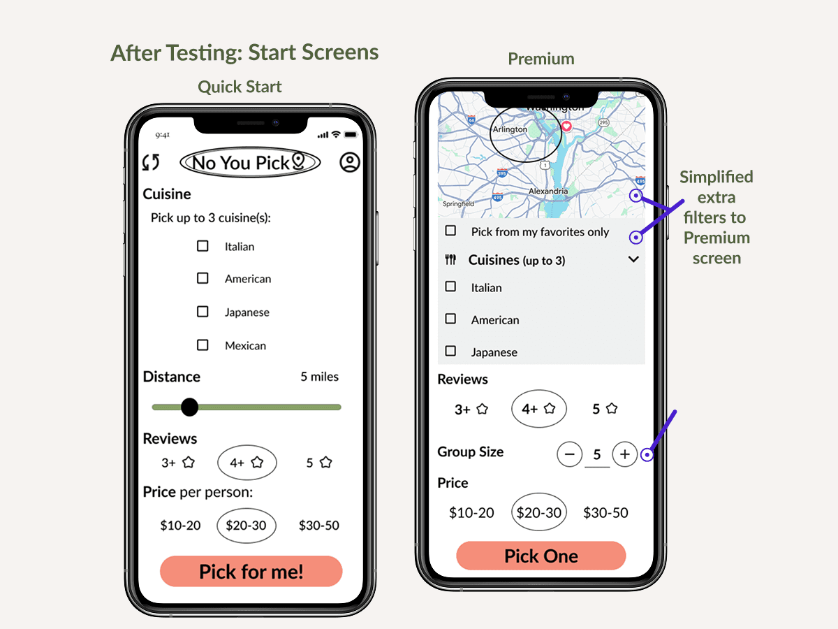
Initially I had three different start screens: 1- Quick Start for anyone, and two for Premium. This was confusing to users, so for the final design I simplified the extra features into the Premium Start.
5 participants were tested through a mix of moderated virtual sessions and unmoderated maze tests.
The app had a ease-of-use score of 76%, indicating a largely intuitive experiences.
60% would spin again to see another restaurant and they liked the option for the restaurant list even if they took more than 2-3 spins before checking.
The three different start screens were used, 1: Quick Start, and two for Premium. This was confusing to users, so for the final design I simplified to 2 screens, Quick Start & Premium Start.

Start Screens
Start Screens
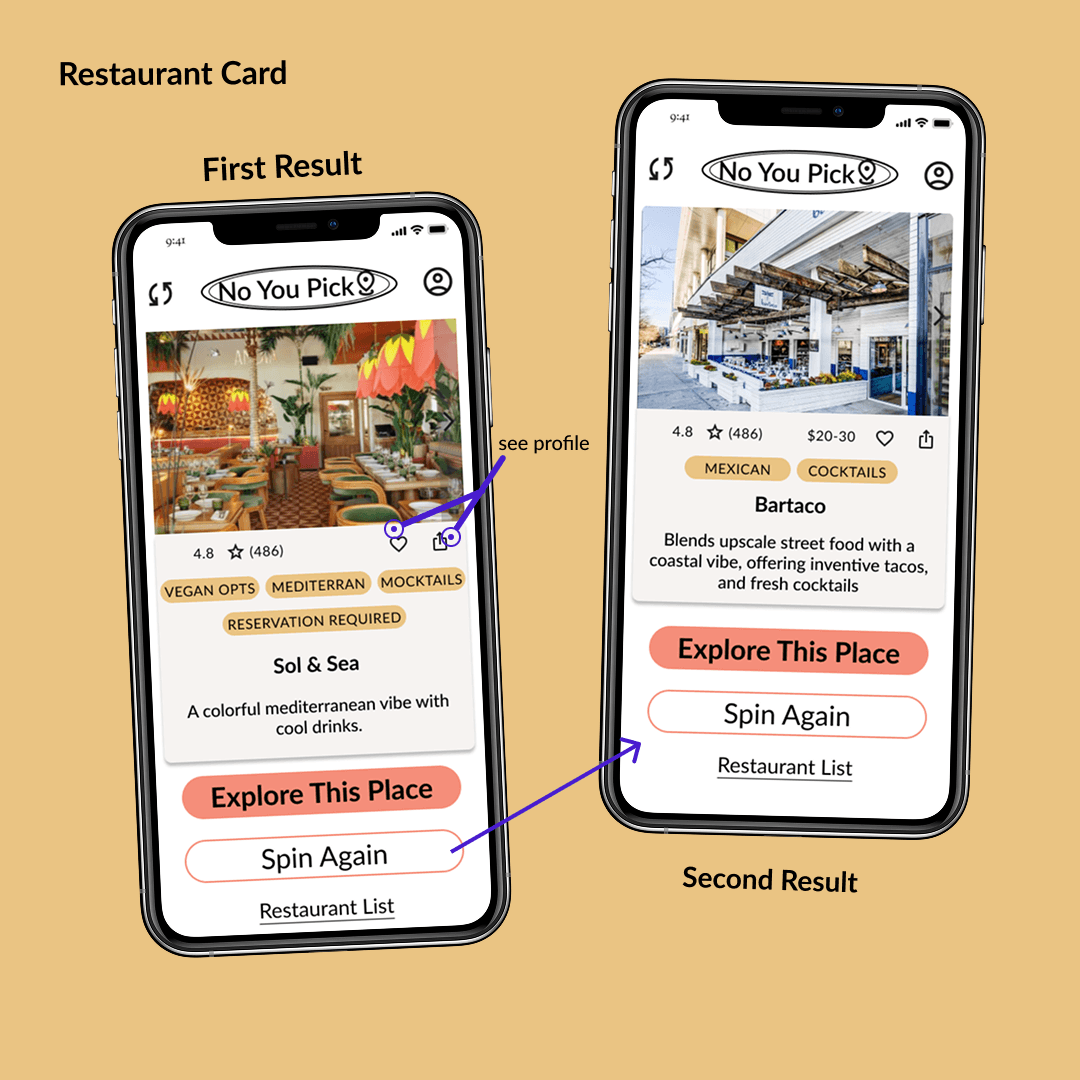
First Results
First Results
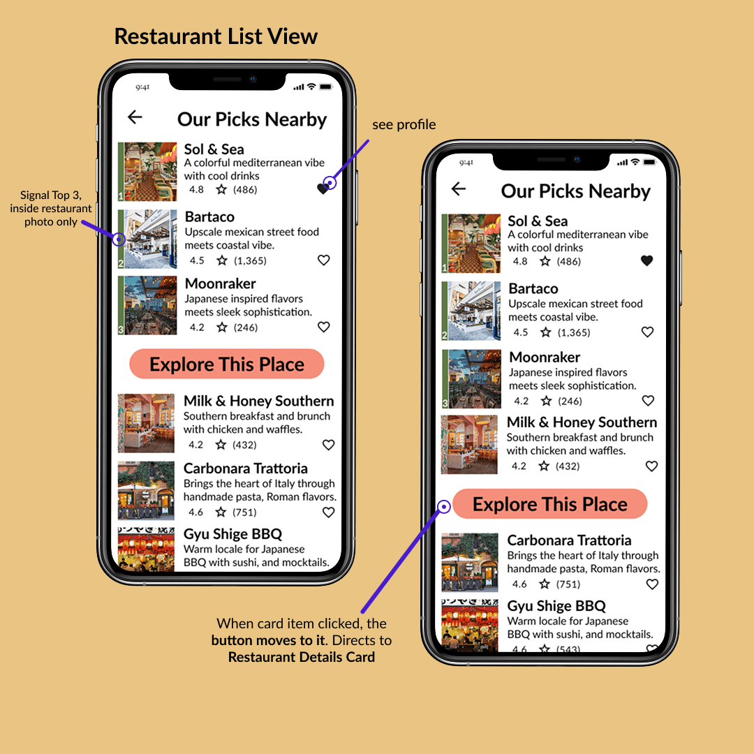
Restaurant List
Restaurant List
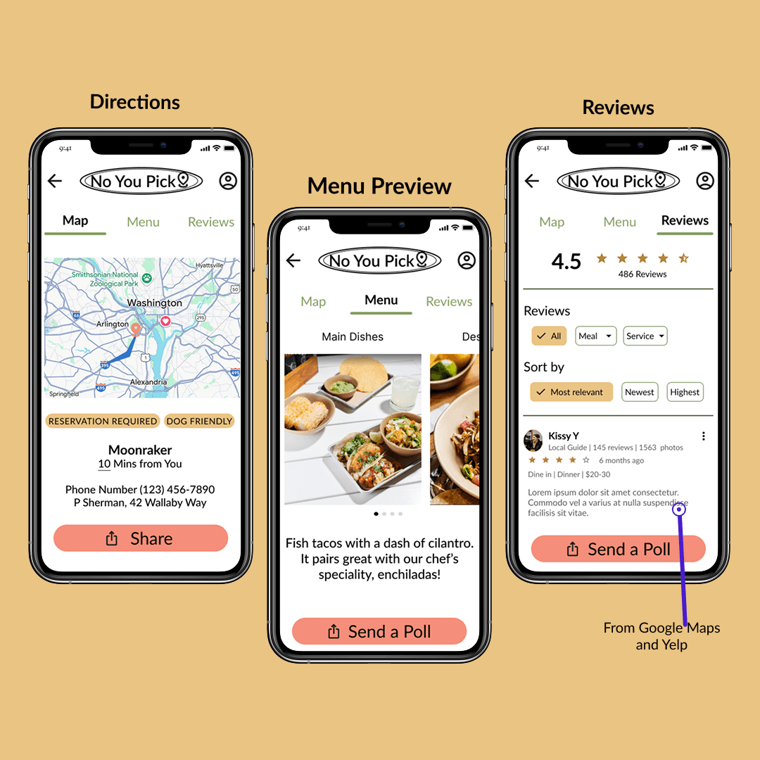
Restaurant Details: Map, Menu, & Reviews
Restaurant Details: Map, Menu, & Reviews
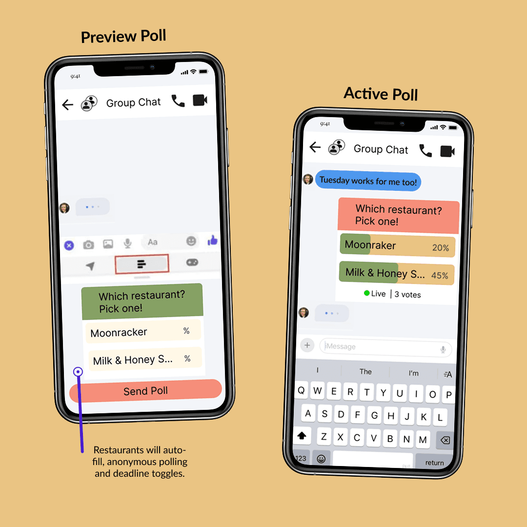
Polling Share Option
Polling Share Option
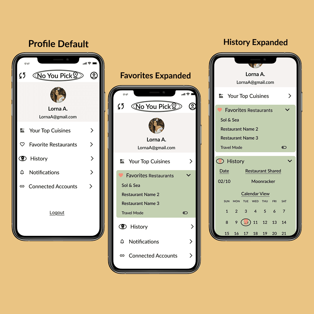
Profile: Saves & History
Profile: Saves & History
Next Steps & What I Learned
Next Steps & What I Learned
As an MVP, further testing is crucial, including 20+ usability sessions and a Product Fit Survey with 100+ users to refine insights for investors. Before development, securing a software engineer for implementation and maintenance will be the next priority.
Solving for friction in group decision-making reinforced how small design choices can drive engagement and ease of use. Real users highlighted the need to balance functionality with delight. Solutions should feel effortless yet enjoyable.
This project reaffirmed that great design isn’t just about solving problems; it’s about crafting experiences that feel intuitive and rewarding.
Thanks for reading!
Questions? Ideas? I'd love to hear your thoughts.
Thanks for reading!
Questions? Ideas? I'd love to hear your thoughts.
Other Projects
No You Pick App

